Helping people lose 500 million pounds
CHANGING LIVES AT MYFITNESSPAL
Finding balance between business goals vs user experience for MyFitnessPal, a nutrition & activity tracking app for over 300 million users.
As design for advocate for weight logging, it was my responsibility to unify the vision by regularly collaborating with stakeholders.
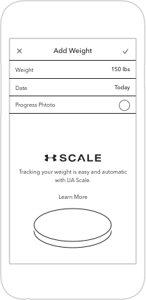
Tracking weight entry point was identified as a low-cost & high return to exceed revenue goals (projected 40% increase of revenue).
Fewer and fewer new and active users are logging their weight, and the majority of users who’s goal is to lose weight hasn’t changed.
At this moment, with our new partners and teammates urgency to understand the surprising data. It came a teaching moment to walk-through and align with the user perspective of how weight tracking had evolved over the years.
Feedback was gathered from email surveys, blog comments, app store reviews and direct messages. Obviously, users are frustrated.

Next step was aligning all these contextual qualitative and quantitative data into documenting friction points. Part of an early stage conversation with PM and other stakeholders.
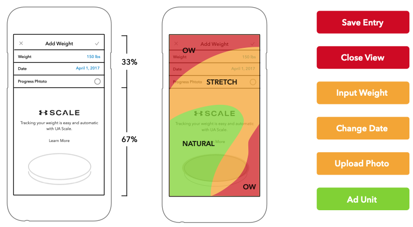
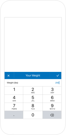
Priority of inputs for ease of use is in reverse. 49% of users navigate with one hand / thumb first, odd no?